Visualizing data is one of the best techniques to understand data.
Visualizing data means that data is presented as a picture instead of as a
table. When you pace data into a picture, it can make it easier to see patterns
or expose patterns that might not have been seen otherwise. There are many
different ways to visualize data. Bar graphs work well for single variables. Pie
charts work well when the data is part of a total. Scatter plots are best when
you doing something and then collect data.
Sometimes if helps to see data visualized before you try to visualize your
own data. In the following paragraphs, data is visualized so that you can draw
some conclusions about the data.
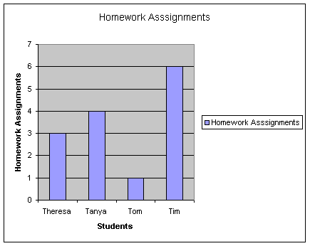 |
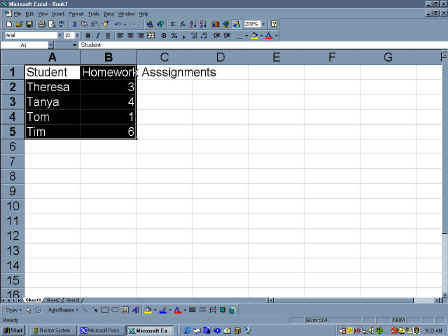
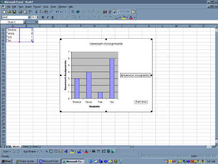
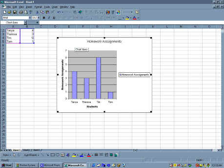
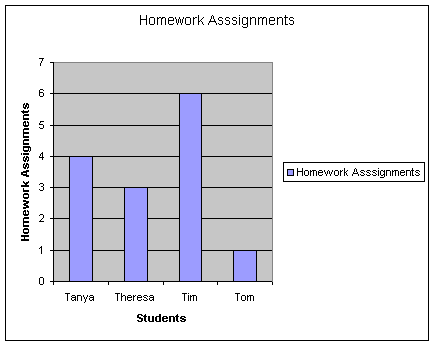
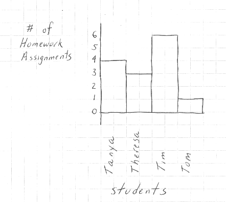
In this bar chart, students are depicted
with their number of homework assignments. When you look at this chart,
some patterns should leap out at you. First, not all of the student have
the same number of assignments. Second, none of the students have the same
number of assignments. This tells you right away that the students are not
in the same classes.
A bar chart, however, can be more helpful than you think. You can
arrange the data within the chart to see if this effects the patterns you
observe. For example, in this chart, the female names appear together and
then the male names. In this case, you can see that the gender seems to
have an influence over the number of assignments. The girls seem to have a
much more similar number of assignments when compared to the boys. |
 |
In this bar chart, the names are arranged
alphabetically. This would help you uncover a trend in the alphabetical
order of students and the number of assignments. A number of studies have
indicated that students do better when they names are near the front of
the alphabet because they tend to be placed near the front of the room
with an alphabetical seating arrangement. We do see this trend in the
chart if we ignore Tim, who has the largest number of assignments. Using
the other students, the assignments decrease through the alphabet. This is
exactly the type of trend that makes graphing data interesting. |
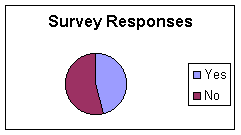 |
In this bar chart, survey responses are pictured. The bar
chart should help you see that the most common response as
"Yes", but is was only by a little more than "No". |
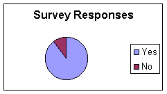 |
In this chart, you can see that the number of yes responses
are greatly in excess of the no responses. Many people can see this trend
much faster than they can read data in a table or in a sentence. |
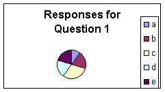 |
In this bar chart, the responses of a test question are
depicted in a bar chart. This makes it very clear that only a few students
selected answer a on the question and that the most commonly selected
response was answer c. Otherwise, the answers were fairly similar. This
means that most of the class was just guessing where a was obviously wrong
and c seemed more right than the others. As a teacher, you would be upset
by these results. |
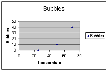 |
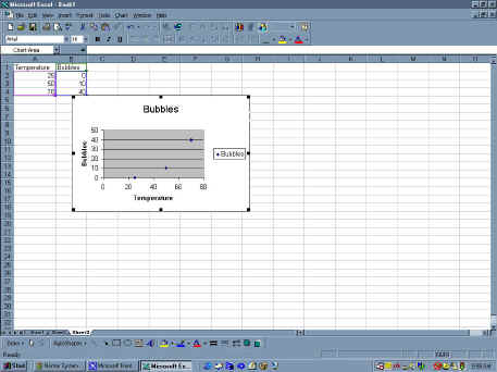
In this scatter diagram, the temperature of a solution is
depicted along with the bubbles that were observed. When you look at the
data, it should be clear that as the temperature increases, the number of
bubbles also increases. This suggests that the bubbles and the temperature
are related to one another. |
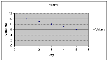 |
In this scatter diagram, you can see that the volume
decreases as each day seems to pass. This is a chart of the evaporation of
water. This means that as time passes, more water evaporates. This makes
sense. This is, however, exactly the opposite trend on the previous
scatter diagram because this chart goes down over time. Nevertheless, the
trend is crystal clear. |
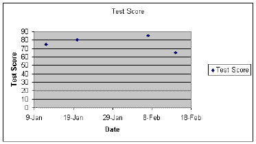 |
This scatter diagram contains specific data on an individual
student's test scores. The date is on the bottom of the graph and the
score goes up and down. Using this graph, you can tell that the test
scores seem to go up over time but then they drop. This suggests that
there might be a pattern but it is not a clear pattern. This is similar to
the data we used in the bar chart when we ranked the students by
alphabetical order. |
| Making a Bar Chart |
 |
Making a graph in excel is really easy. In order to make a
bar chart, all you have to do is enter your data into a spreadsheet. Once
you have entered your data, you can highlight the data by dragging the
mouse across the data from the top left to the bottom right.
Alternatively, you can place the cursor in the top left box, and hold down
shift while you move the arrow keys to the bottom right box. |
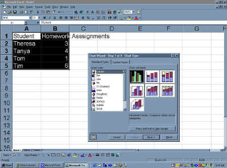 |
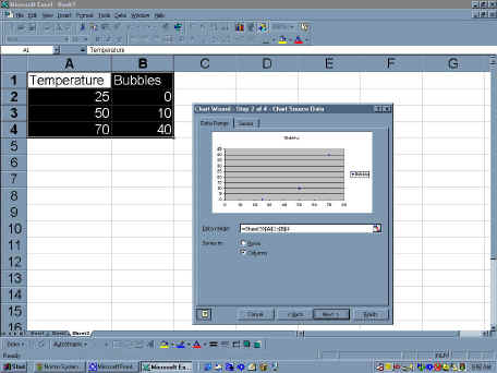
Once the data is selected, you can click on the graph
icon on the top of the screen. If you do not see the icon, click on
"Insert" to get a list of choices. Select "Chart" from
the choices and you will see the chart wizard appear. The very first
choice is a bar chart, so go ahead and click on it and then click
"Next". |
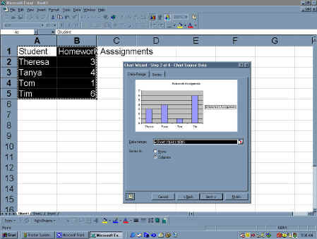 |
The wizard will then change appearances and give you a
preview of your data. You will see a number of choices in the box. You
should see that the columns choice is already selected, which is correct.
you could also change the data range, but it is also fine. So, just click
next. |
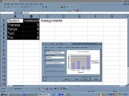 |
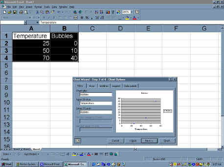
The wizard will now give you the choice to add some
data labels. You should always do this but it can be a little tricky. The
x axis is always the sideways axis. This makes sense because x sounds like
if should be across. The vertical or the up axis is called the y axis,
which also makes sense because the y goes looks like it is reaching up.
You can then type in the titles by placing the cursor in the box and
entered the text with the keyboard. When you move the cursor out of the
box, the text will appear on the chart. You can preview your graph this
way.
|
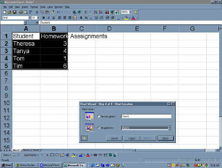 |
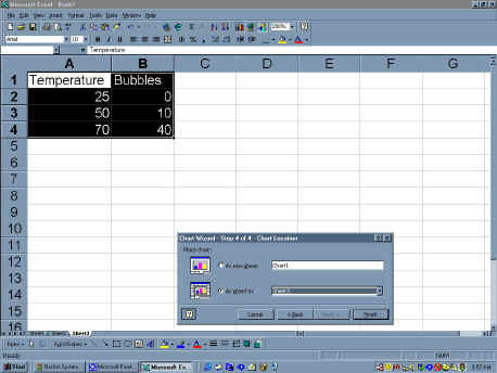
The very last step asks you to identify a location for your
graph. The default choice is on the current worksheet and this is a good
choice, so just click on finish and you will see the chart right in front
of you. |
 |
This is what you will see after you have completed the
steps in chart wizard. |
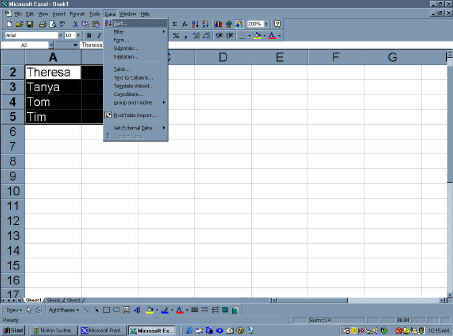 |
There are times when you want to test how sorting effects
your graphs. In these situations, you can sort your data and just watch
you graph be updated. To do this, select the Data choice from the top of
the screen to get a menu to appear. On the menu, select Sort, it is
usually the first choice. |
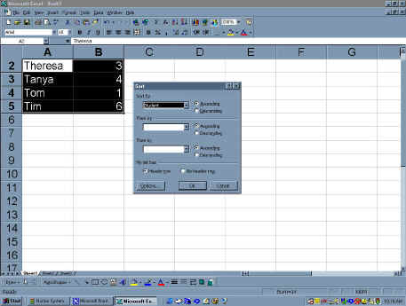 |
This will then give you a box that asks you to select
a way to sort the data. In this example, you can chose the student choice.
This will rank the students in alphabetical order. |
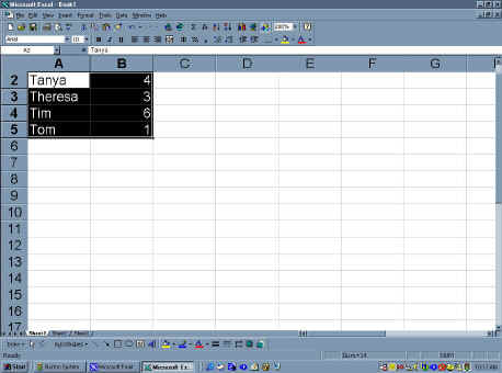 |
This is how the students will appear on the
spreadsheet. |
 |
The graph will be automatically updated. |
 |
You can copy and past the graph into any application
you choose. |
| Making a Pie Chart with Excel |
|
 |
Making a pie chart is probably the most difficult type
of chart you can make. Pie charts are difficult because they involve
making a series of calculations to determine how large a section of the
pie should be used for each component.
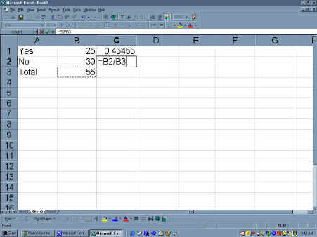
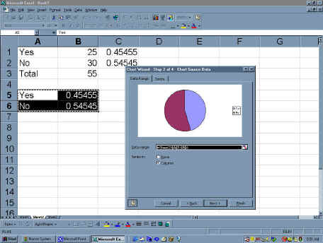
However, using excel, pie charts are easy. Start making a pie chart by
entering data into the table. You can convert the raw data into percentages
using the formula functions. To enter a formula, you place the
cursor in the box and type the "=" sign. Then, you can highlight
the value you want to use. for example, the value of B:1 is 25. The total
number of respondents was 55. If you enter "=B1/B3" you will get
.45. This was already done. In the figure, you can clearly see the
"=B2/B3" , which produces the value .55.
|
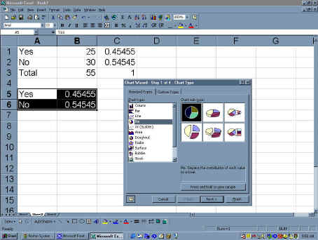 |
You can then paste these values next to some labels so
that you can highlight these values and nothing else. After you have
highlighted the data, select the chart icon or select the insert menu from
the top of the screen and then select the chart item from the insert menu.
The chart wizard should then appear. Select the pie chart option. If
should be the fourth choice. When you have selected the pie chart option
you should see a number of different pie charts. Select the first one and
hit next.
|
 |
You should now see a preview of your pie chart. There
should already be a legend and the program made all the nasty calculations
for you. You can select next. |
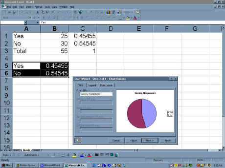 |
You should now see a series of choices to add more
titles. Since you do not need any, go ahead and hit next. |
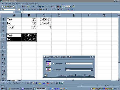 |
The wizard will now ask you for a location to send
your chart. The default choice is the current spread sheet, which is fine,
so go ahead and click on the finish button. |
|
|
| Making a Bar Chart by Hand |
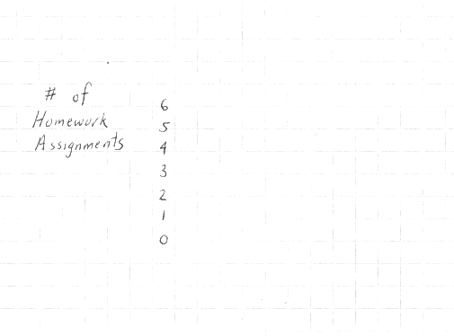 |
The first step in making a bar chart is to lay-out the axes.
This is the hardest part and it requires a little planning. to make this
easier, you should do everything in pencil and the go over it in ink.
Mistakes are very common and you should never feel like they are a bad
thing.
In a bar chart, you are usually using some data with numbers and some
data without numbers. I always put the numbers on the up and down or the
vertical axis. Then, I write the numbers next to it.
Writing in the numbers is no easy task. You need to know a couple of
things before you can make a good axis. First, you need to know your
minimum and maximum values. In this case, the smallest value is 1 and the
maximum is 6. Since the graph paper has more than 6 liens, you can just
use a single line to represent each value. In other cases, you will have
more values than lines. For example, you may have ten lines but data with
a minimum of 0 and a maximum of 100. In his case, you would make each line
worth 10, so that the values in the 20s would go on the second line and
the 3rd line would get the values in the thirties. |
 |
Once the vertical axis is complete, you can worry about the
side to side or horizontal axis. If you are using graph paper, this is
easy. I just use two lines for every group. In this case, the groups are
the student names. Since there are four names, I use 8 spaces and I draw a
line across the graph that spans eight spaces.
I leave a space between each name to make them easier to read.
Then, I count the number of spaces in the longest name so that if I wrote
a letter in each box, it would fit. Then, I make this with a faint line
away from the axis so that I know where to start each name. In this case,
the longest name is Theresa, which requires 7 spaces. Then, I turn the
paper so that I am writing normally and I write in each name while
skipping a line between each name. When I have written in each name, I
write the label below all the names. |
 |
Once the axis are complete, making the graph is easy. To
start, I look up the value for Tanya and find that she had 4 assignments.
I go to four on the vertical axis and draw a line across the graph that
spans two lines. Then, I draw a vertical line to the bottom axis so that
there is a rectangle next to Tanya's name. I repeat this for each name.
Tim's data is the hardest to plot because it is a tall box next to a short
box. in this case, you have to draw tow lines down to complete his box. |
| Making a Pie Chart by Hand |
 |
The first step of making a pie chart is to make a circle.
This circle was made on graph paper. A center point was selected in the
middle of the paper. Then, I made a mark 5 lines away in every direction,
above, below, right and left. Then, I connected the lines by drawing an
arc.
Another technique would involve setting a compass to five lines and
then spinning it one time around. A compass is the premiere technique, but
since you don't always have one around, the previous techniques is nice to
now. |
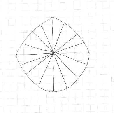 |
After I have drawn the circle, I bisect the circle. I eye
ball the bisections to same time. If you had a compass, you could measures
the angles. The first bisection would be 180 degrees. You would do this
twice.
Since I eye balled the bisections, I made the first one by following
the vertical axis of the circle. I did the same thing for the horizontal
section of the circle.
Then, I divided each quarter in half so that I had 8 sections. I then,
divided these into halves for a total of 16 sections. Since 100/16 = 6.25%
per section. This means that I color enough sections, at 6.25%, to match
the percentage I am trying to show. So, if I was graphing the yes
responses at 60%, I would color in 9 sections. Ten sections would be too
much because 10*6.25=62%
|
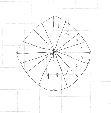 |
In this image, you can see the 9 sections I will shade,
numbered 1-9. I can then shade them anyway I want. In this example, I will
shade them using a black pen. I can then leave the test of the section
blank. |
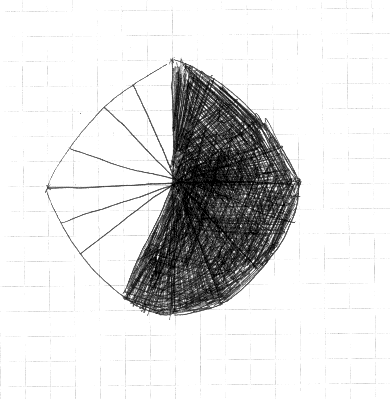 |
This is the shaded section of the pie chart that was shaded
using black ink. I colored the inside first and then I colored the outside
edges by rotating the paper. This enabled me to color the whole shape
using straight lines and not arcs. This made it a lot easier to have a
uniform color and to remain inside the lines. |
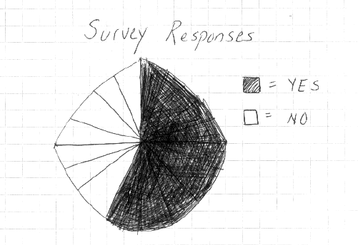 |
Once the shape was colored, I added the legend and a title
to complete the pie chart. You could then remove the lines in the blank
section so that it appears. |
| Making a Scatter Diagram by Hand |
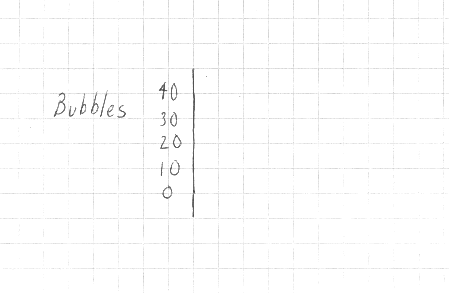 |
The first step in making a scatter plot from hand is to make
the vertical axis. This is identical to the steps of making the vertical
axis in the bar chart example, which means the first step is to find the
maximum and minimum values. In this case, the maximum value was 40 and the
minimum was ten. The difference between them is 30 lines, which is much
more than the number of available lines. Since there were more than ten
lines available, I could have made each line worth 3. But, I decided 10
would make the graph easier to read so I wrote 40 on he top line, and then
30, 10, 10 and 0 below the line. Next to the numbers, I made a vertical
line. |
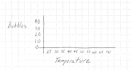 |
The horizontal axis was not as easy to make because the data
had a maximum of 70 and a minimum of 25. Using a line for a single value
would required more than 40 lines. Since I had a little more than ten
lines, I decided that 5 per line was a good choice. So, I drew in the
numbers from 25 to 70 by fives. Then, I drew a line across the paper above
the numbers. Below the numbers I drew in a label, Temperature. With the
axis in place, I could then match the values to the graph. |
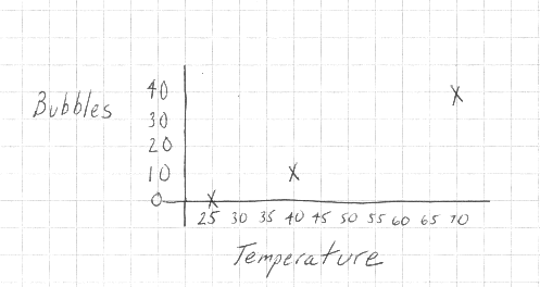 |
The first value was 25 for temperature and 0 for bubbles.
This means I went to the temperature axis, the across axis, and found the
value 25. Then, I found the 0 of the horizontal axis, and found the point
where the two axis intersected. At this point, I drew an "x". I
repeated this until I had plotted all three points. |